Radio Buttons
Radio Buttons
Radio button fields in 2.1.0 work essentially the same as with earlier versions. As with checkboxes and dropdown fields, radio buttons first and foremost need a data source: i.e. the options that will appear in the radio button list. Like before, those options are defined in Option Lists (formerly called "Field Option Groups").
So, when you change a field type on the Edit Form -> Fields tab from (say) a textbox to a radio button group, you also need to edit the field in the Edit Field dialog window and assign the data source. But I get ahead of myself! Let's look at the available settings first - that'll help make sense of the field type.
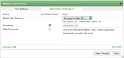
In the Edit Field dialog, there are three available options:
- Option List / Contents: this field is required. It specifies the data source for the radio buttons. You have two choices: either use an Option List, or use the values pulled from a field from another form. This latter option is quite exciting: it effectively lets you tie together two distinct forms. Any time a new submission is added to the second form, the value in the field you specify will be included in the list of radio buttons displayed by this field.
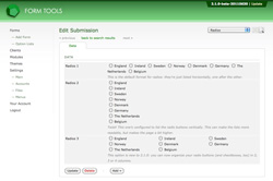
- Formatting: this is best illustrated in the screenshot at the top of the page. It gives you a little control over how the radio buttons are displayed. The options are: horizontally (one next to the other), vertically (one above the other), or in 2, 3 or 4 columns. These latter options really help present the radios in a clear format.
- Field Comments: as with the other field types, this setting lets you add a comment to appear underneath the field.

