Textboxes
Textboxes
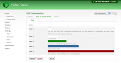
Textboxes are the most common field type. Chances are, most of your form fields are textboxes. Before 2.1.0, the only thing you could customize about this field type was the size - and that was dependent on the database size allocated. 2.1.0 provides a lot more control. The screenshot to the right shows 5 different textboxes, each configured slightly differently.
Settings tab
As with all field types, to choose a textbox for one of your fields just go to the Edit Form -> Fields tab. There, select the Textbox field type on the main page, or click the Edit icon and select it there. As with all other field types, the first tab of the Edit Field dialog contains the same information and is discussed here.
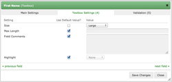
The custom field settings for the Textbox field type are shown in the screenshot to the right. Here's what they all mean (but you can probably figure it out by the labels!).
- Size: this controls the width of the field.
- Max Length: this lets you control the maximum number of characters that people enter into the field.
- Field Comments: this setting lets you add some comments to the field. Sometimes it can help to provide a little explanation to what information a field is storing - the field label (Display Text) may not be enough. Comments appear underneath the field.
- Highlight: this displays the textbox in a particular colour: red, orange, yellow, green or blue. Sometimes it can help to draw emphasis to particular important fields.
Validation tab
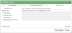
As of Form Tools 2.1.4, you can now add field validation to ensure that each field contains the appropriate data when submitted through Form Tools.


